
Workbox helps ambitious, dynamic organizations succeed online. Since 1997.

Workbox started working with Jazz before they were a publicly traded company, 16 years ago. We just launched the 6th version of their brand and website.
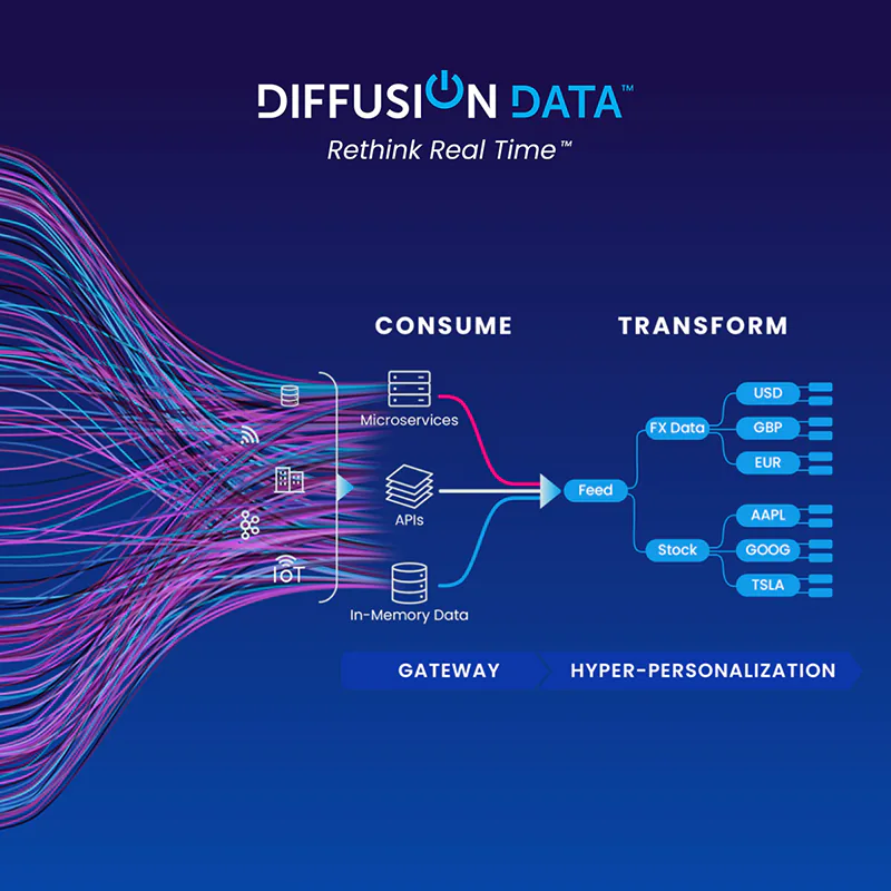
DiffusionData (formerly Push Technology) needed to explain their complex offering to both technical and business audiences and rebrand at the same time.
Workbox gathers your ideas and transforms them into a full-blown website with all the marketing tech you need. We push existing brands’ websites to the next level. We turn your PSD, Illustrator, InDesign, XD and Figma designs into complete websites. And sometimes Workbox just makes your site go faster.
No matter their industry or market, our clients are sophisticated in their field and want that “Workbox special something” to help them achieve their goals online. The industries we tend to work with are pharmaceutical, SaaS, financial services, B2B and branding & marketing agencies.

From cutting-edge technology companies, to powerful pharmaceuticals, San Francisco-based Workbox has helped all sorts of businesses succeed on the Web – since 1997.
We’ve seen online marketing change a lot since we started in 1997 - and it isn’t stopping. But no matter how technology and markets evolve, your company needs to tell its story and meet its goals online now – whether it’s sales, leads or improving its overall brand. Our experienced team understands so your business gets the right solution on-time and on-budget.
We also have a massive network of professionals with expertise that complements Workbox’s in-house skills. Our headquarters is in San Francisco, California, USA
Email: info@workbox.com